# Load and attach ggplot2
library(ggplot2)

# Plot variable hwy from dataset mpg
p <- ggplot(mpg, aes(x = hwy)) +
  geom_density()

p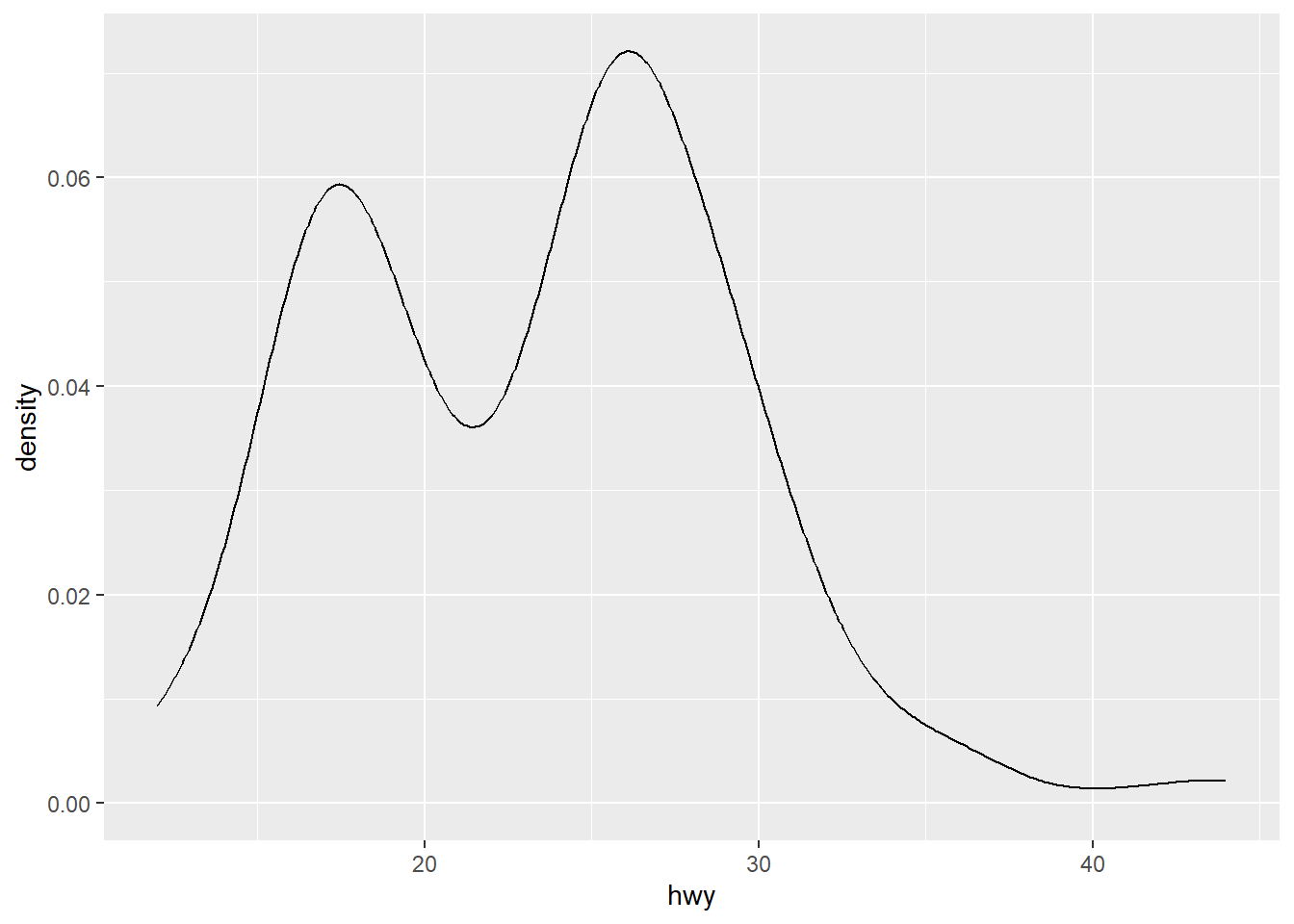
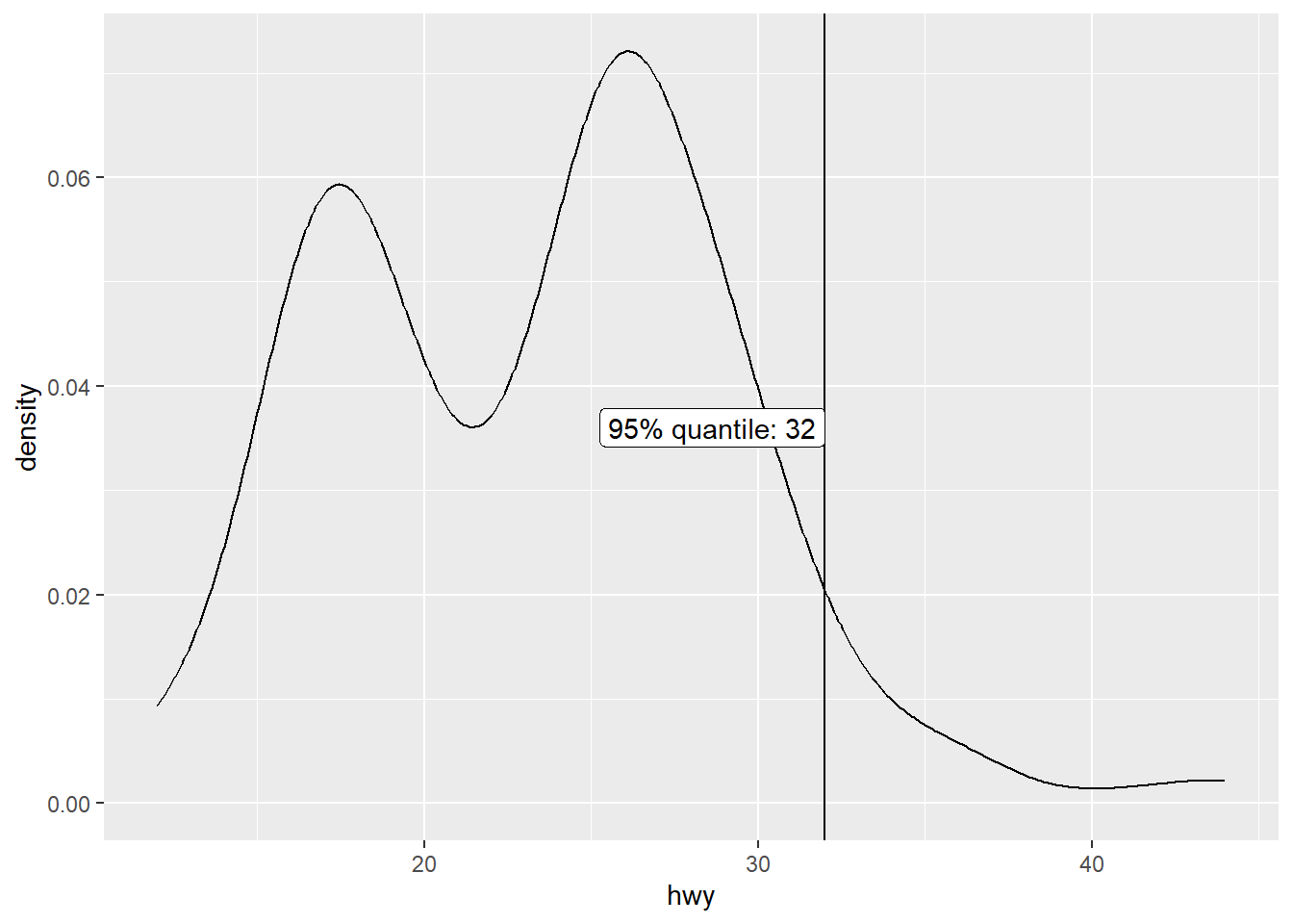
Imagine you want to label a certain value in a distribution and you want this label to be in the centre of the plot (in y direction). However, where the centre exactly is depends on the plotted data. Especially when plotting densities, the y coordinates are not straight-forward to guess. In addition, if you want to write a function, the code should work for all possible datasets.
The solution is to first create the plot without the label, extract its size, and use it to annotate the label at the correct position.
# Load and attach ggplot2
library(ggplot2)
# Plot variable hwy from dataset mpg
p <- ggplot(mpg, aes(x = hwy)) +
geom_density()
p
# Get minimum and maximum of x and y
x_min <- ggplot2::layer_scales(p)$x$range$range[1]
x_max <- ggplot2::layer_scales(p)$x$range$range[2]
y_min <- ggplot2::layer_scales(p)$y$range$range[1]
y_max <- ggplot2::layer_scales(p)$y$range$range[2]

# Annotate label to 95% quantile at y = y_max / 2
q <- quantile(mpg$hwy, 0.95)

p +
  geom_vline(aes(xintercept = q)) +
  annotate(
    "label",
    x = q,
    y = y_max / 2,
    label = paste0("95% quantile: ", q),
    hjust = "right"
  )
This section provides some patterns for using package patchwork (Pedersen 2025) for combining ggplots.
library(patchwork)Titles cannot be collected. Instead, a title for the combined graph needs to be specified in the plot_annotation(title = "Title") function. subtitle and caption can be added in the same way.
p1 <- ggplot(mpg, aes(x = cty)) +
geom_density()
p2 <- ggplot(mpg, aes(x = hwy)) +
geom_density()
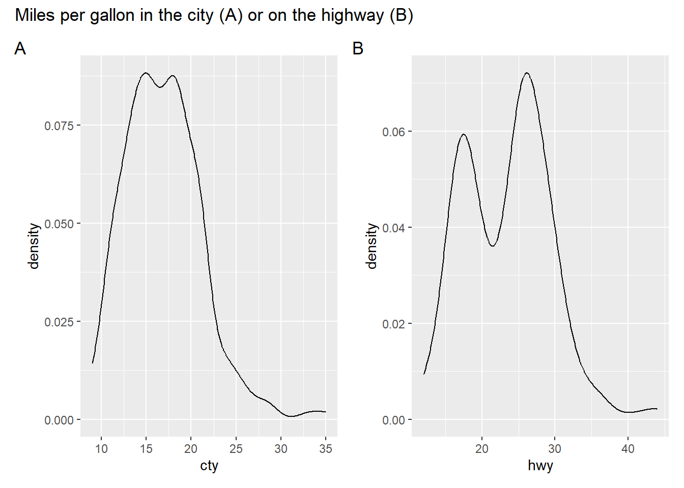
p1 + p2 + plot_annotation(title = "Miles per gallon in the city or on the highway")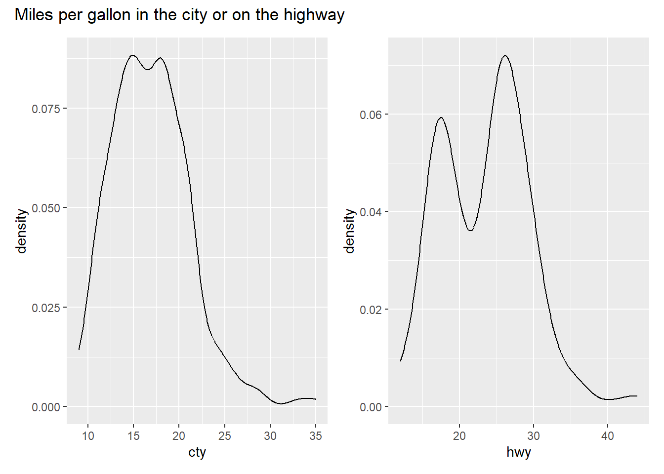
Subplots can be numbered (e.g., with “A”, “B”, “C”) in patchwork using plot_annotation(tag_levels = "A"). Possible options for tag_levels are:
'a' for lowercase letters'A' for uppercase letters'1' for numbers'i' for lowercase Roman numerals'I' for uppercase Roman numeralstag_levels can be combined or individual lists of tags can be specified. Look at the documentation for plot_annotation() for examples.
p1 + p2 +
  plot_annotation(
    title = "Miles per gallon in the city (A) or on the highway (B)",
    tag_levels = "A"
  )
wrap_plots()Sometimes using the patchwork operators (+, |, /) does not work, e.g., because the number of plots is not known in advance, and function wrap_plots() needs to be used instead. Here, guides/legends and axes can be collected as well. Function plot_annotation() is added with the + operator.
library(tidyverse)

mpg$year %>%
  unique() %>%
  purrr::map(\(x) mpg %>% filter(year == x)) %>%
  purrr::map(\(x) ggplot(x, aes(x = cty, y = hwy, color = drv)) + geom_point()) %>%
  wrap_plots(.,
    guides = "collect",
    axes = "collect"
  ) +
  plot_annotation(tag_level = "A")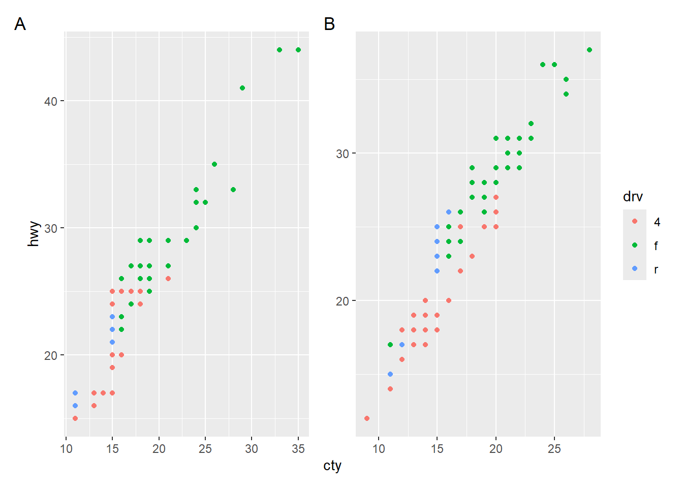
Operators & and * can be used to add plot elements to multiple/all plots in the combined graph. See the documentation of the operators for more information. One application is that the legend position can be adjusted in the combined plot.
mpg$year %>%
  unique() %>%
  purrr::map(\(x) mpg %>% filter(year == x)) %>%
  purrr::map(\(x) ggplot(x, aes(x = cty, y = hwy, color = drv)) + geom_point()) %>%
  wrap_plots(.,
    guides = "collect",
    axes = "collect"
  ) +
  plot_annotation(tag_level = "A") &
  theme(legend.position = "bottom")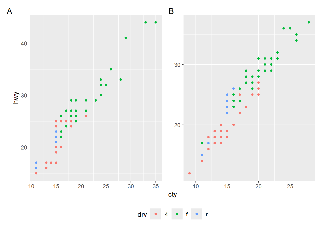
Please note that this approach overwrites existing specifications in the individual plots.
p1 <- mpg %>%
  filter(year == 1999) %>%
  ggplot(aes(x = cty, y = hwy, color = drv)) +
  geom_point() +
  theme(legend.position = "none")

p2 <- mpg %>%
  filter(year == 2008) %>%
  ggplot(aes(x = cty, y = hwy, color = drv)) +
  geom_point() +
  theme(legend.position = "left")

# Legends as specified in the individual plots
p1 + p2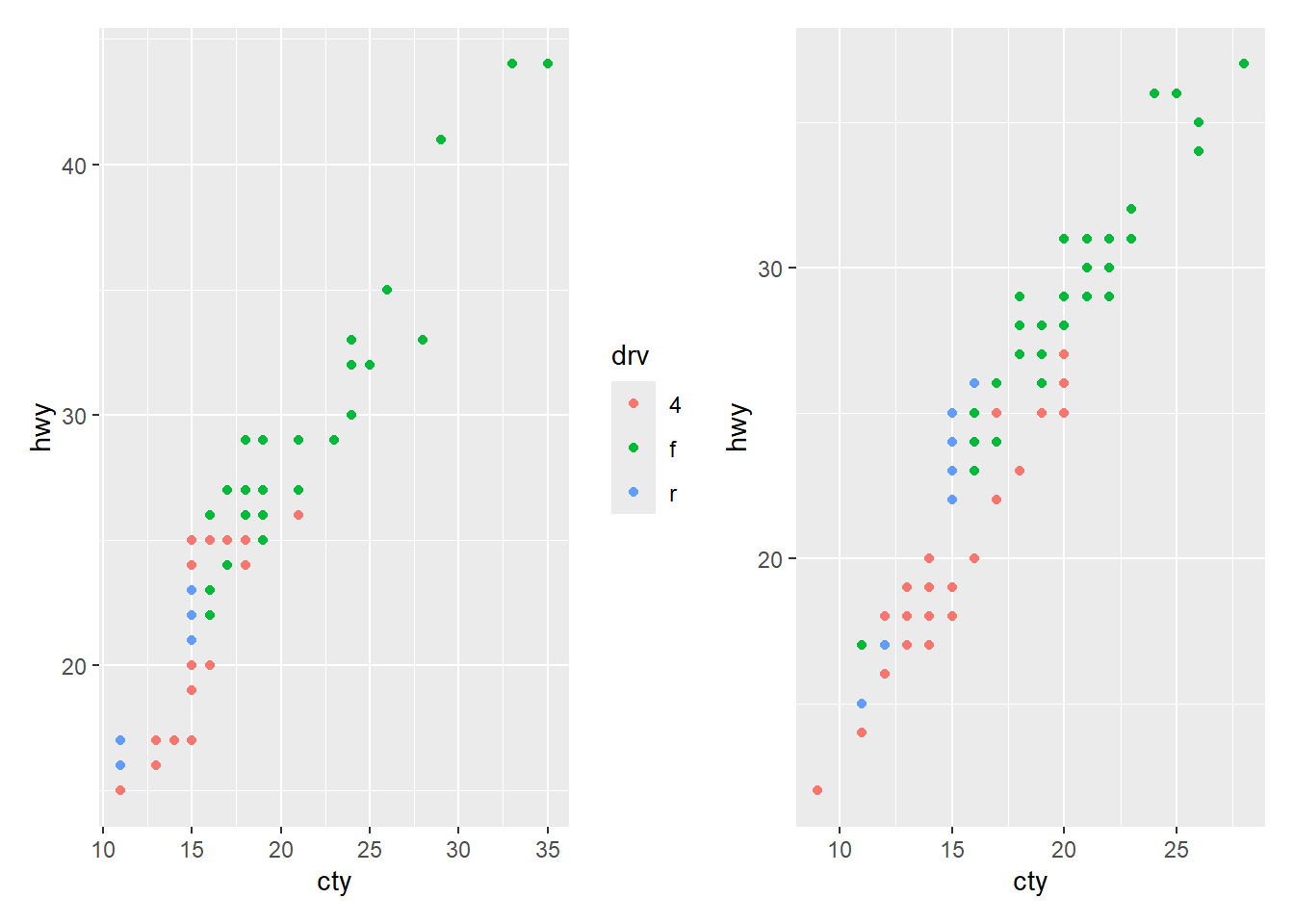
# Both legends move to the top
p1 + p2 & theme(legend.position = "top")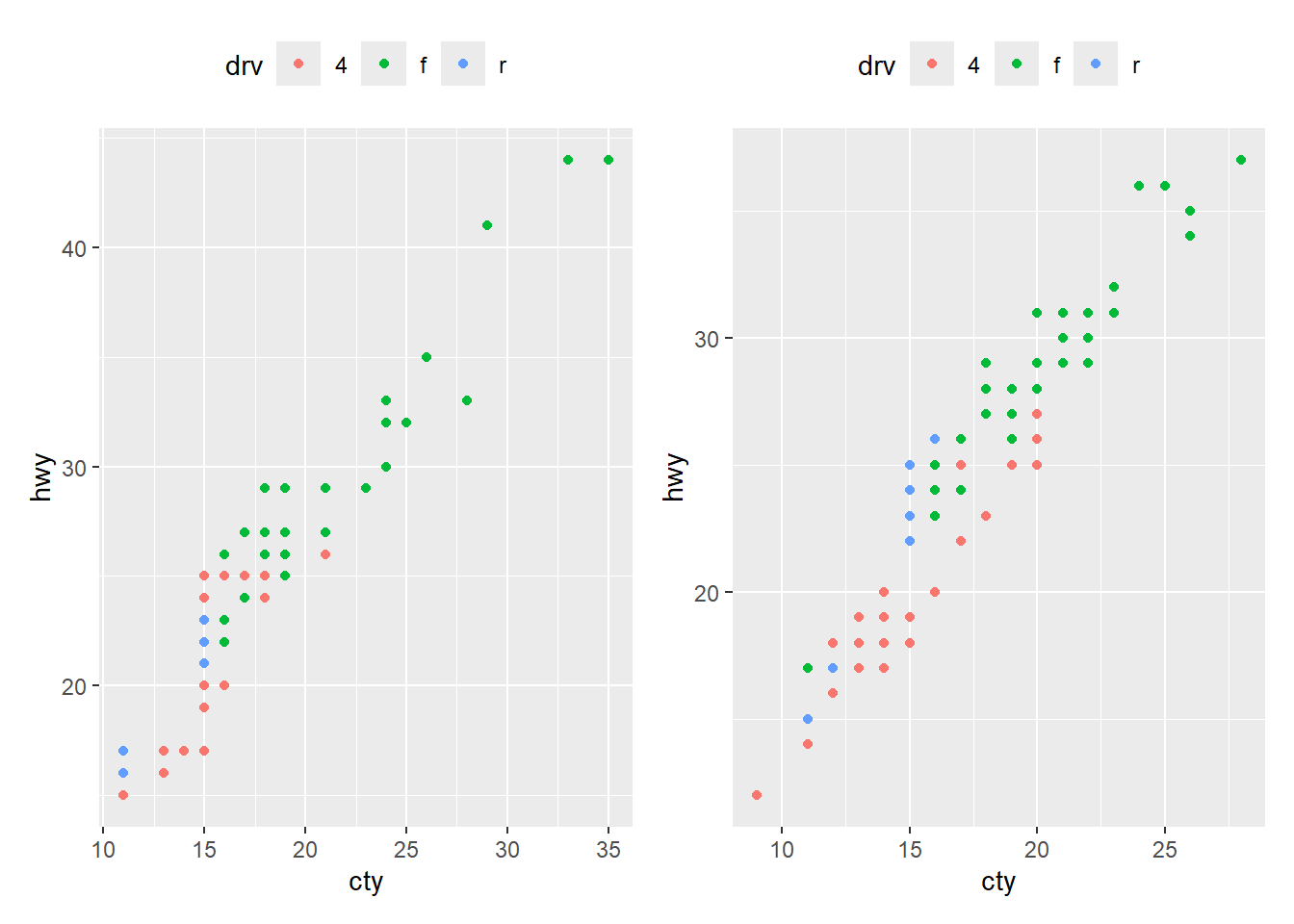
# Collecting legends moves them to the right by default
p1 + p2 + plot_layout(guides = 'collect')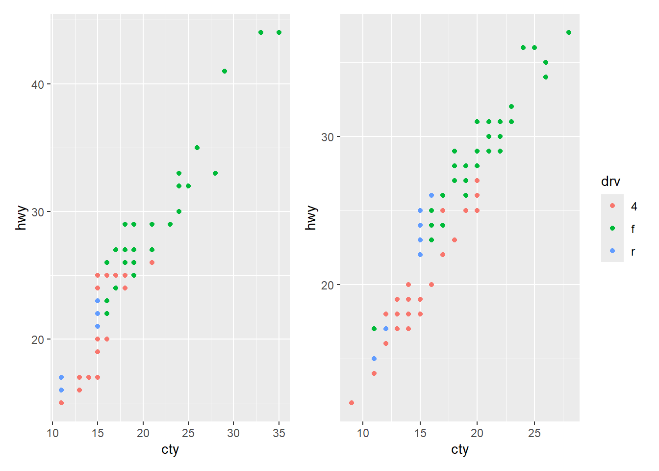
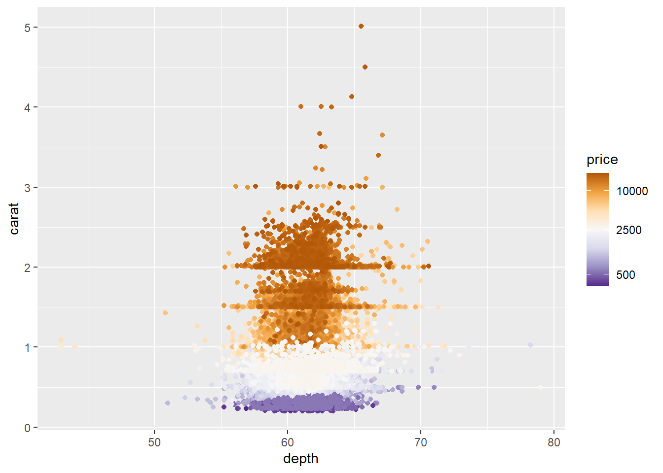
A log transformation can be included in the scale_color_*() and scale_fill_*() functions via argument transform = "log". When using the log transform, the numbers in the legend are automatically created and usually have decimals. Use argument breaks to specify better values.
# No tranformation
ggplot(diamonds, aes(x = depth, y = carat, color = price)) +
  geom_point() +
  scale_color_distiller(palette = "PuOr")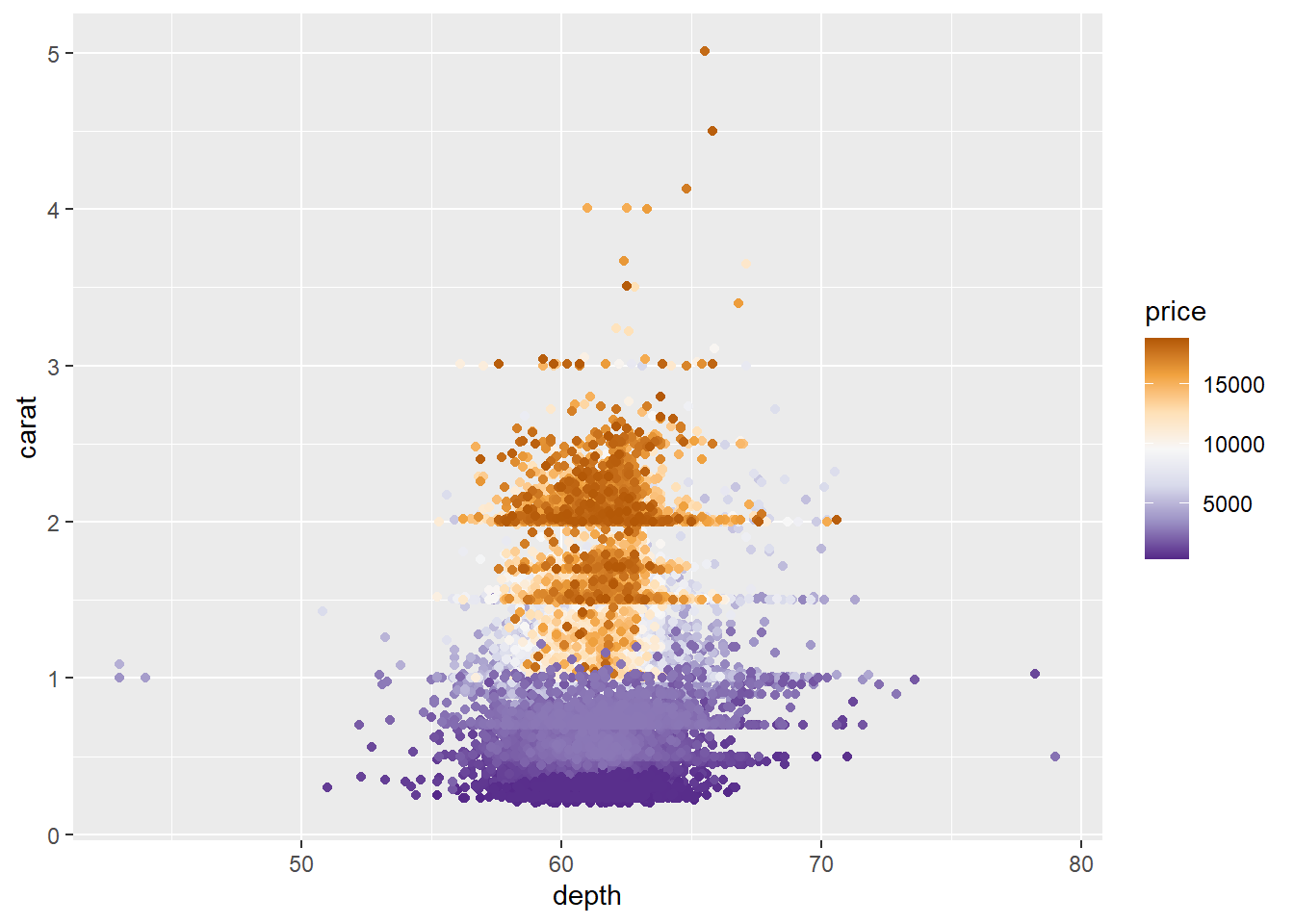
# Log tranformation causes legend numbers to change
ggplot(diamonds, aes(x = depth, y = carat, color = price)) +
  geom_point() +
  scale_color_distiller(palette = "PuOr", transform = "log")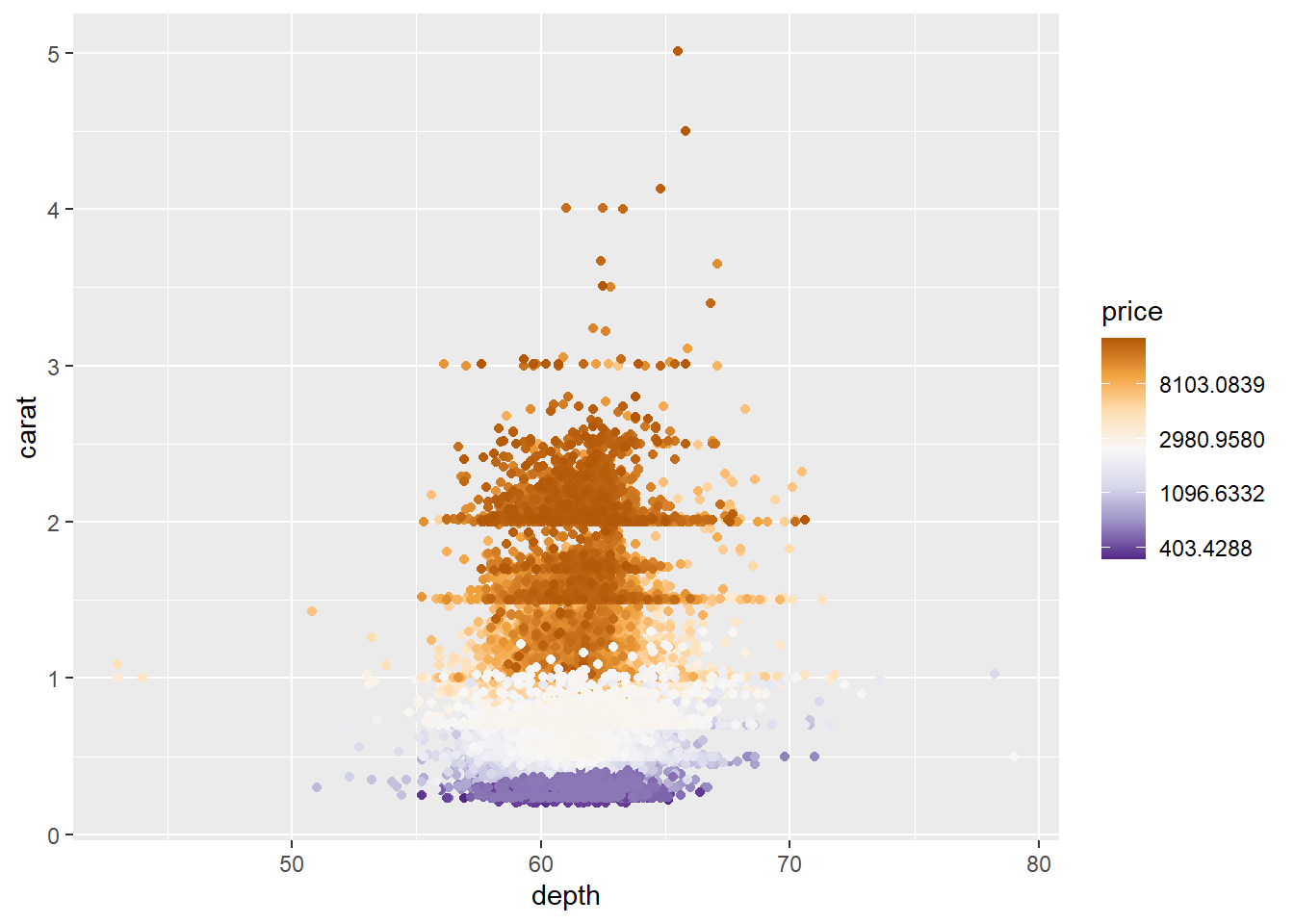
# Specify numbers in legend with 'breaks'
ggplot(diamonds, aes(x = depth, y = carat, color = price)) +
  geom_point() +
  scale_color_distiller(palette = "PuOr", transform = "log", breaks = c(500, 2500, 10000))